What Is Kinetic Typography, and Why Does It Captivate Us?
We have a question from our team: Have you ever watched a movie title sequence that made your heart race? Or a promotional video where words danced across the screen with such personality you couldn’t look away? That’s kinetic typography in action—the art of animating text to create emotional impact, enhance storytelling, and communicate messages with unforgettable visual power.
Kinetic typography (literally “moving type”) transforms static words into dynamic visual elements that move, grow, change, and interact. It’s where graphic design meets animation, where language gains physical presence, and where messages don’t just tell—they perform.
The Evolution: From Silent Films to Digital Revolution
Kinetic typography isn’t a new concept. Its roots trace back to:
Early Cinema (1920s-1930s)
Silent films used intertitles—text cards between scenes—that occasionally featured simple animations. Pioneers like Saul Bass in the 1950s revolutionized title sequences with his work on “Psycho” and “Vertigo,” making opening credits an art form in themselves.
The Digital Age (1990s-Present)
With the advent of Adobe After Effects, Apple Motion, and other animation software, kinetic typography exploded. Suddenly, designers could manipulate text with precision timing, 3D effects, and complex movements previously impossible.
Why Kinetic Typography Works: The Psychology Behind Moving Words
1. Enhanced Memory Retention
Research shows that combining visual and auditory information with motion can increase retention by up to 65%. When words move with meaning, they create stronger neural connections.
2. Emotional Amplification
The speed, direction, and style of text movement directly influence emotional response:
- Fast, explosive text = excitement, urgency
- Slow, graceful movements = elegance, seriousness
- Bouncy, playful animations = humor, lightheartedness
3. Hierarchy and Focus
Motion guides the eye. Kinetic typography can emphasize key points, create narrative flow, and ensure viewers absorb information in the intended sequence.
4. Personality and Brand Voice
Font choices combined with specific animations create distinct personalities. Compare Apple’s clean, minimalist type animations with Disney’s magical, whimsical text treatments.
Types of Kinetic Typography
1. Motion Typography
Text that moves but maintains readability as primary text. Common in explainer videos and presentations.
2. Animated Calligraphy
Hand-lettered or script fonts brought to life, often used for personal, artistic, or luxury brand messaging.
3. 3D Kinetic Type
Text with depth, perspective, and spatial movement. Popular in movie titles and high-end commercials.
4. Interactive Kinetic Typography
Text that responds to user interaction—hover effects, scroll-triggered animations, click responses on websites.
5. Experimental/Abstract
Type pushed to its limits, where readability sometimes takes a backseat to artistic expression.
Essential Principles for Effective Kinetic Typography
Timing Is Everything
The relationship between text animation and audio (voiceover, music, sound effects) is crucial. Perfect sync creates magic; poor timing creates confusion.
Readability First, Always
No matter how beautiful the animation, if viewers can’t read the text, you’ve failed. Maintain sufficient dwell time and clear contrast.
Purpose-Driven Motion
Every movement should serve the message. If text flies in from the left, ask: Why left? Does that direction support the content’s meaning?
Less Is Often More
Over-animating can overwhelm viewers. Strategic restraint creates impact where it matters most.
Tools of the Trade: Creating Your Own Kinetic Typography
Beginner-Friendly Options:
- Adobe After Effects (industry standard)
- Apple Motion (great for Mac users)
- Canva (simple online tool with templates)
- Lumen5 (AI-assisted text-to-video)
Advanced Workflow:
- Script & Storyboard → Plan every word and movement
- Audio Preparation → Record voiceover or select music
- Font Selection → Choose typefaces with personality
- Animation → Animate with precision timing
- Sound Design → Add effects that complement movements
- Export & Optimize → Format for intended platform
Real-World Applications Across Industries
1. Marketing & Advertising
- Social media ads that grab attention in 3 seconds
- Product explainers that simplify complex features
- Brand storytelling that creates emotional connections
2. Education & E-Learning
- Animated definitions and key concepts
- Historical timelines that come alive
- Scientific processes visualized through moving text
3. Entertainment
- Movie and TV show title sequences
- Music video lyrics that enhance the song
- Video game interfaces and narrative elements
4. Corporate & Internal Communications
- Animated mission statements and values
- Training materials that engage employees
- Conference presentations that stand out
Inspiring Examples to Study
Saul Bass’ Title Sequences
Study “North by Northwest” or “Anatomy of a Murder” for masterclasses in setting tone through type.
Apple Keynote Presentations
Notice how their text animations reinforce product messaging—clean, precise, innovative.
“The Social Network” Opening
Text appearing and disappearing like digital conversation—perfect for the Facebook story.
“Stranger Things” Title Sequence
Retro typography with glitch effects that perfectly establishes the 80s/sci-fi horror tone.
Common Mistakes to Avoid
1. Motion Sickness
Excessive or erratic movements that literally make viewers uncomfortable.
2. Style Over Substance
Fancy animations that distract from, rather than enhance, the message.
3. Inconsistent Branding
Animations that don’t align with established brand guidelines.
4. Ignoring Accessibility
Not providing captions or considering color contrast for text.
The Future of Kinetic Typography
AI-Generated Animations
Tools that automatically animate text based on content analysis and emotional tone.
Real-Time Rendering
Live kinetic typography in AR/VR experiences and interactive installations.
Responsive Typography
Text animations that adapt to viewer biometrics (heart rate, eye tracking).
Haptic Feedback Integration
Moving text paired with physical sensations in wearable tech.
Getting Started: Your First Kinetic Typography Project
Beginner Exercise: Animate Your Favorite Quote
- Choose a meaningful quote (30 words or less)
- Select a font that matches the quote’s tone
- Break it into 3-5 animated segments
- Add subtle background music
- Aim for 15-30 seconds total
- Share on social media with #KineticType
Resources to Explore:
- School of Motion (premium courses)
- Video Copilot (free After Effects tutorials)
- Typewolf (font inspiration)
- Behance (see what top designers create)
Why Kinetic Typography Matters Now More Than Ever
In our scroll-heavy, attention-scarce digital landscape, kinetic typography isn’t just decorative—it’s strategic. It meets viewers where they are (on screens) and delivers messages in the language they understand (visual, dynamic content). Whether you’re a marketer trying to cut through noise, an educator seeking engagement, or an artist exploring new mediums, kinetic typography offers a powerful toolkit for communication.
The words we use matter. But how they move, appear, and interact with viewers can transform good messaging into unforgettable experiences. In a world saturated with static content, moving words don’t just communicate—they captivate, persuade, and inspire.
Ready to make words move? Start with what you have: your phone’s video editor, free online tools, or just paper and pencil for storyboarding. The most important element isn’t the software—it’s your understanding of how motion supports meaning. Because in kinetic typography, every movement tells part of the story.
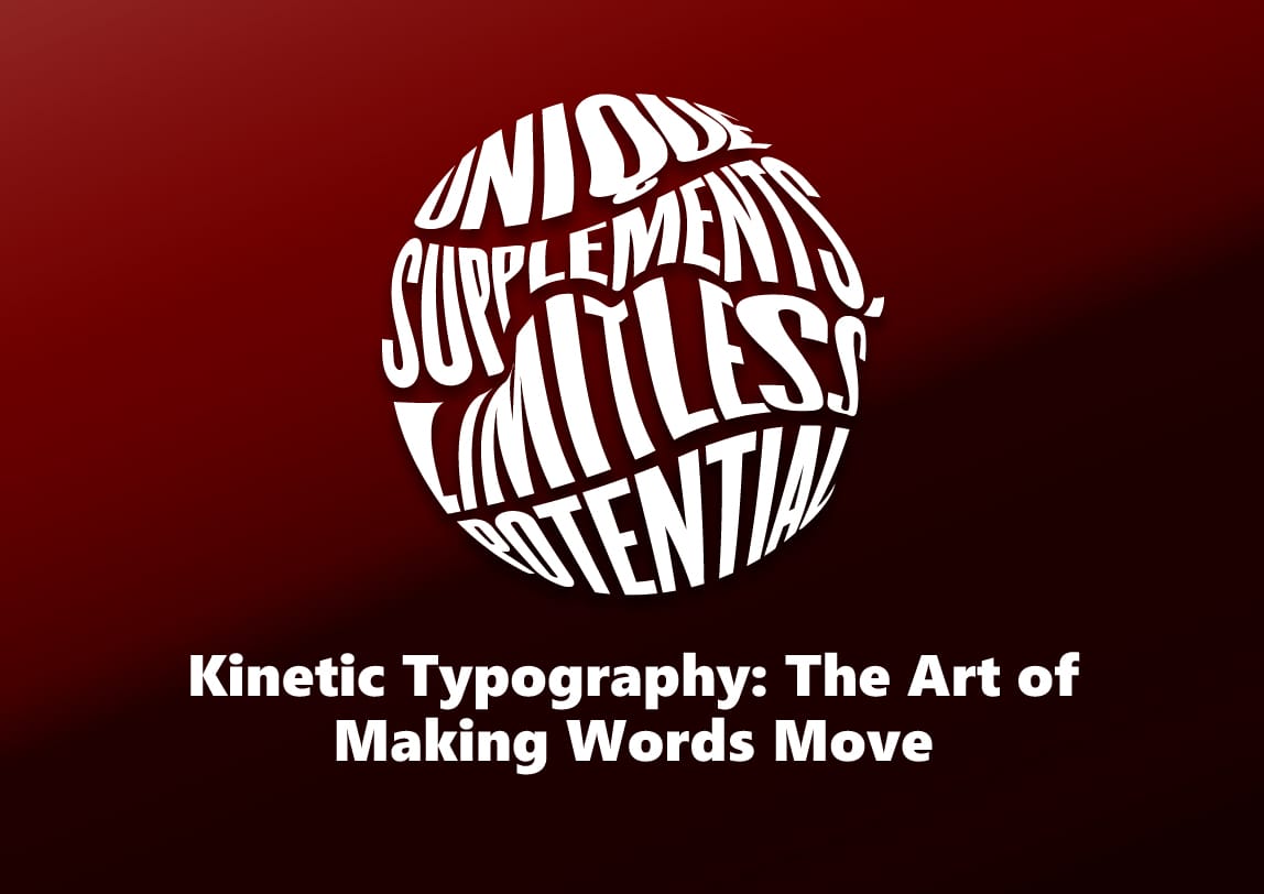
or if you wanted to get this type of beautiful kinetic illustration or typography contact with the best designer in Sutton Coldfield, the Birmingham-based agency is2dio Capital.
Feel free to book your call!
Our creative department waiting for you.